BigCommerce (WIP)
At BigCommerce, I spent six years leading the UX and design of the mobile app—my primary area of ownership. Throughout that time, I focused on elevating the user experience, contributing to a significant ratings boost from 3.9 to 4.5 on the App Store and from 3.2 to 4.1 on Google Play. While I also supported key desktop initiatives, the mobile experience remained my core responsibility. The app now supports dark and light modes and is localized in 12 languages, enabling merchants around the world to manage their stores with ease.

Some of the features and functions I designed and advocated for include:
New add/edit catalog experience
Create draft order and order
Create shipment
In-app survey
App review or feedback prompt
Dashboard features and news
Multiple language support
Data and analytics section
UX improvements to notifications settings
UX improvements to login, including Passkey
UX debt cleanup sprints
case study: mobile’s create shipment
enterprise iOS and android App
We launched a popular feature that enabled merchants to use their phones as barcode scanners for streamlined shipping. With their device in hand, they can scan products while packing, confirm quantities, and instantly link tracking labels to shipments—reducing errors and improving fulfillment efficiency.
THE STRATEGY
Given our team size, full parity with BC’s desktop Control Panel wasn’t feasible. Instead, we focused on the key tasks our users needed—and wanted—to accomplish while away from their desks.
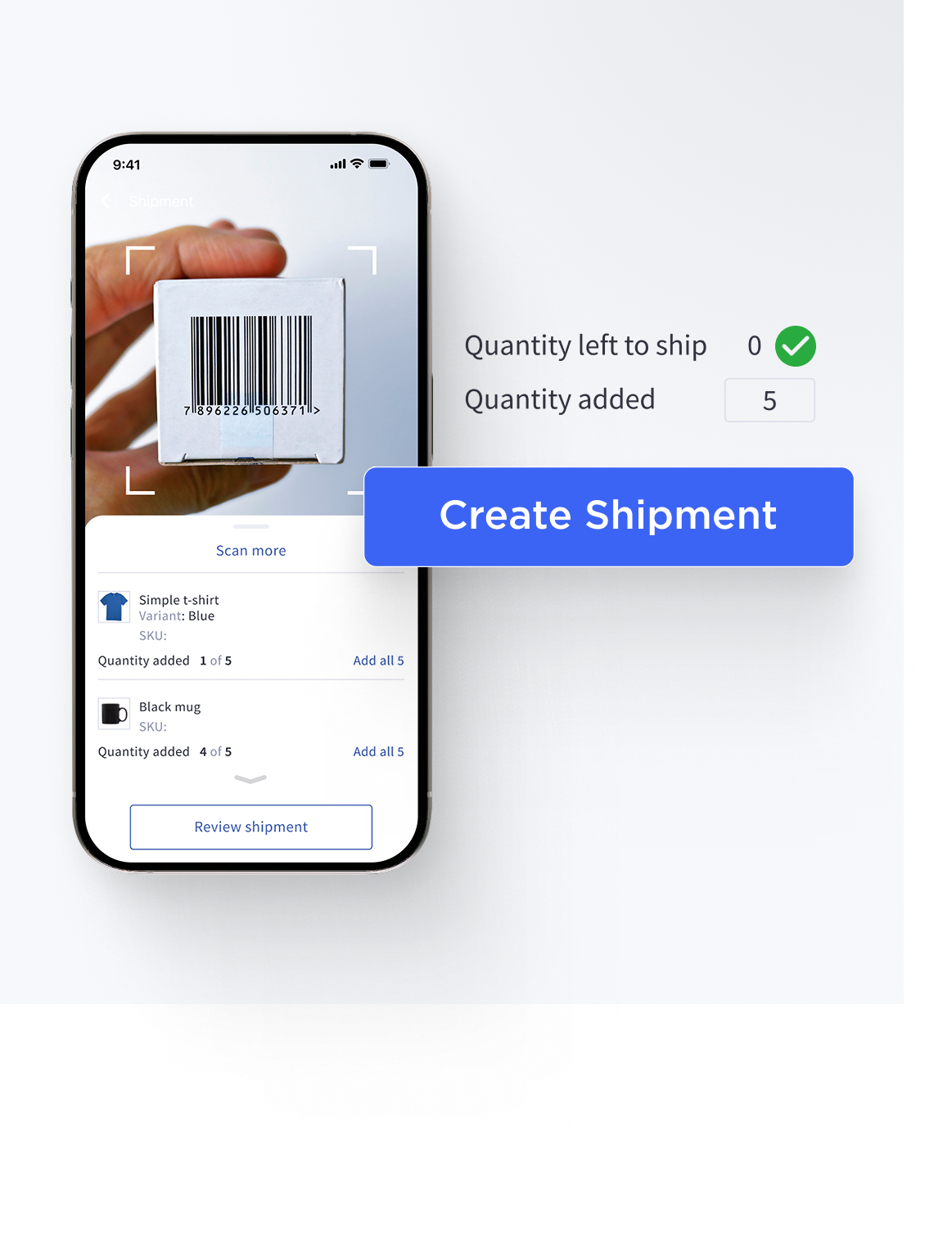
For a quick look at the core UI features, the shipment landing screen opens with brief, helpful instructions. Users can scan product SKUs individually or bulk add them to a shipment. Clear confirmations guide the process, and shipping details can be added with a simple scan—making the entire flow fast and intuitive.
Case study: mobile’s improved and enhanced anaLyTics
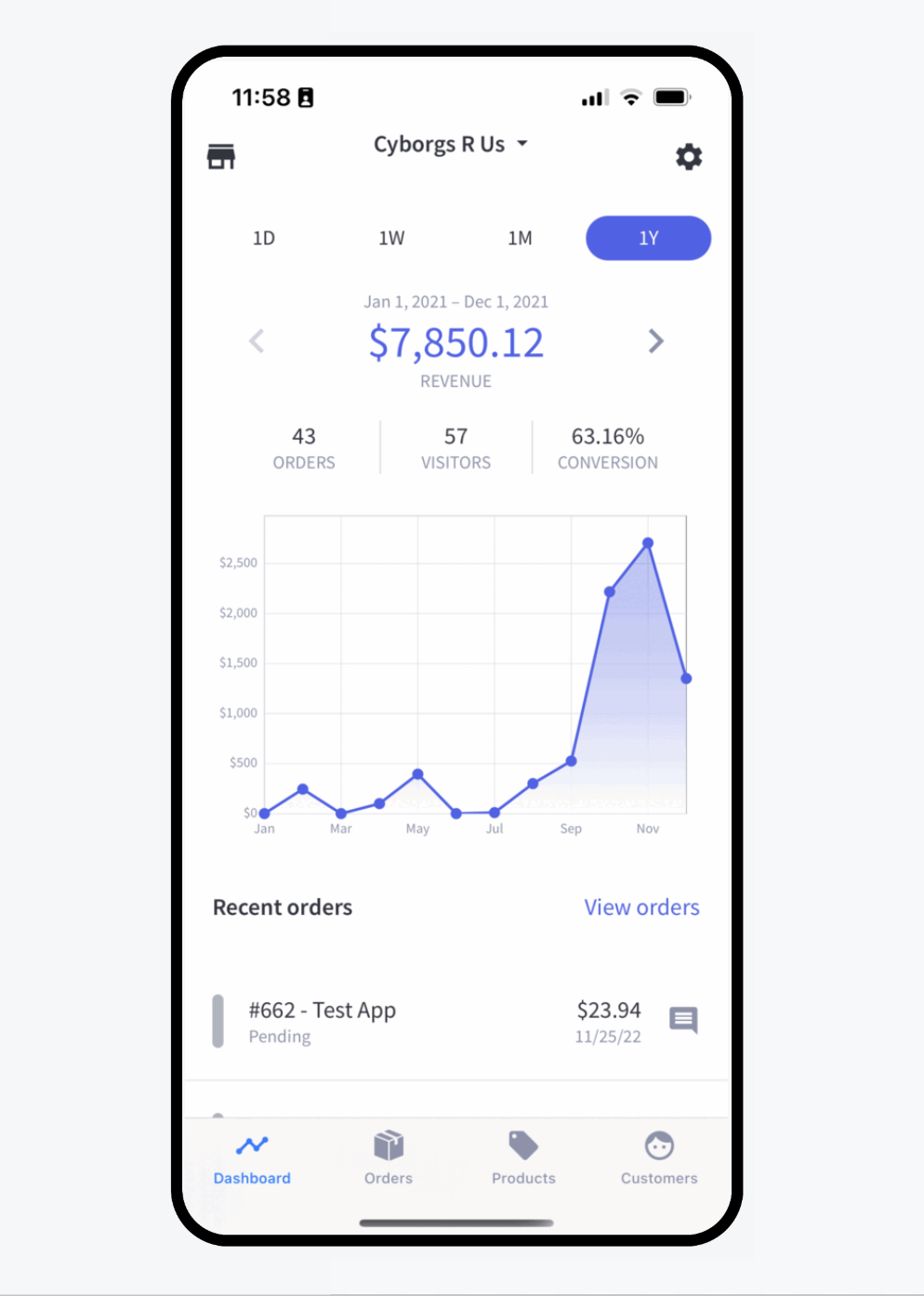
Initial Mobile Analytics Experience
The mobile app’s analytics were limited to a single dashboard view, displaying total revenue alongside a basic line graph. Additional metrics included order count, visitor count, and conversion rate, all shown across fixed time ranges—1 day, 1 week, 1 month, and 1 year—with the option to compare against the previous period.
There was no dedicated analytics section in the app—only this high-level snapshot—providing limited depth or flexibility for merchants seeking actionable insights on the go.
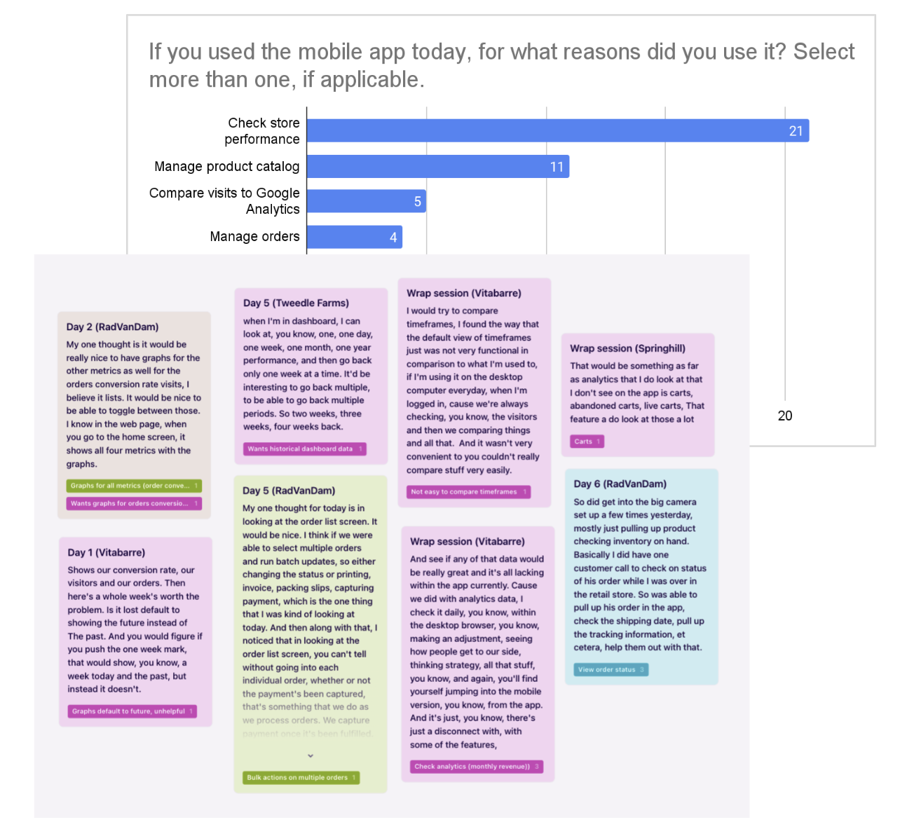
Top: Quantitative activity data from five merchants over a 7-day period
Bottom: Qualitative insights on analytics and data needs gathered during the 7-day diary study
Problem: No Dedicated Analytics Section in the Mobile App
Through a 7-day diary study with five merchants, we found that users were consistently seeking more detailed, flexible, and actionable analytics from the mobile app. While the existing dashboard offered a high-level snapshot, merchants expressed the need to:
View and compare metrics across custom time ranges
Access deeper insights like trends, conversion rates, and cart data
Perform key analytics tasks on mobile that they were accustomed to on desktop
Without a dedicated analytics section, users faced friction when trying to access meaningful insights—making it difficult to make quick, informed decisions while away from their desks. Although the diary study revealed a clear gap, we knew broader validation was needed.
To help inform product roadmap prioritization, we then planned to collect feedback from a broader group of merchants to determine whether these insights aligned with the needs and behaviors of our wider user base.
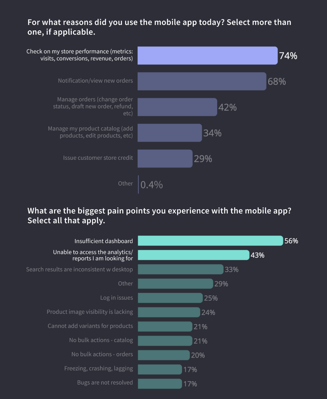
Survey Results: Strong Demand for Deeper Analytics
To build on insights from our earlier diary study, we launched an in-app survey, completed by 239 merchants. The results highlighted a clear pattern: merchants primarily use the mobile app to monitor store performance—and they’re looking for more robust, flexible analytics to support that need.
74% of respondents said their primary reason for opening the app was to check store performance metrics (e.g., visits, conversions, revenue, orders).
The top two pain points were:
"Insufficient dashboard" (56%)
"Unable to access the analytics/reports I am looking for" (43%)
These findings reinforced what we had learned through qualitative research: the app's current analytics offering fell short of merchant expectations. The lack of flexibility, depth, and customization made it difficult for users to get the insights they needed on the go.
This data gave us the quantitative validation we needed to prioritize a dedicated and more powerful analytics experience in the mobile roadmap.
Breaking down the problem
As part of our work to improve analytics in the mobile app, we began by framing the core problem: how can we provide merchants with meaningful, actionable performance data while on the go?
To do this, we partnered closely with the data team to better understand existing use cases, chart/report usage patterns, and the technical opportunities available on mobile. We also worked to uncover:
What types of analytics are most commonly used in the Control Panel?
Which of those reports would be valuable to access on mobile?
What actions should be possible from mobile, based on merchant needs?
How can we best visualize and summarize the most important data?
What technical or platform-specific features could enhance the mobile experience?
Our approach was collaborative—we leaned on internal expertise, ran workshops, and identified how mobile could both align with and expand upon what was already working in the desktop experience. This discovery work helped shape our strategy and ensured that future analytics enhancements were grounded in both user needs and platform strengths.
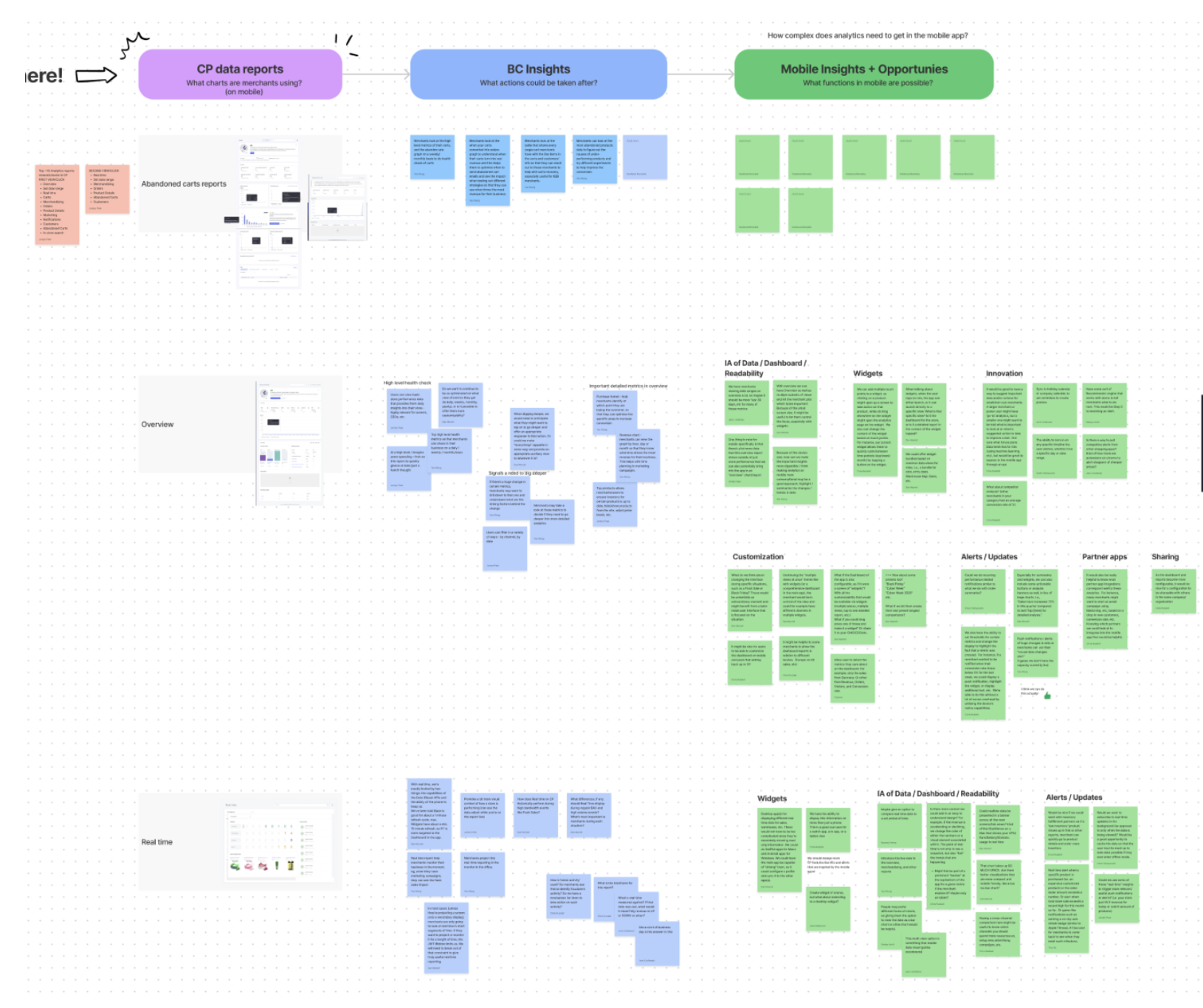
Collaboration with Data Team: Insights & Opportunities
To gain a holistic understanding of the problem space, our mobile and data teams partnered closely to explore both user needs and platform capabilities. We analyzed usage data, report traffic, and merchant goals to better understand how analytics were being used in the Control Panel—and what could translate meaningfully to mobile.
Our findings revealed that the Overview, Orders, Merchandising, and Carts reports were the most frequently accessed and most valuable to merchants. We also discussed specific mobile-forward opportunities, such as:
Real-time alerts triggered by key changes in data
Lightweight analytic widgets for quick, actionable insights
These conversations helped us evaluate the trade-offs between content parity and mobile-optimized UX, guiding us toward a solution that didn’t simply mirror desktop analytics, but instead reimagined them for a more focused and responsive mobile experience.
Navigation & Information Design
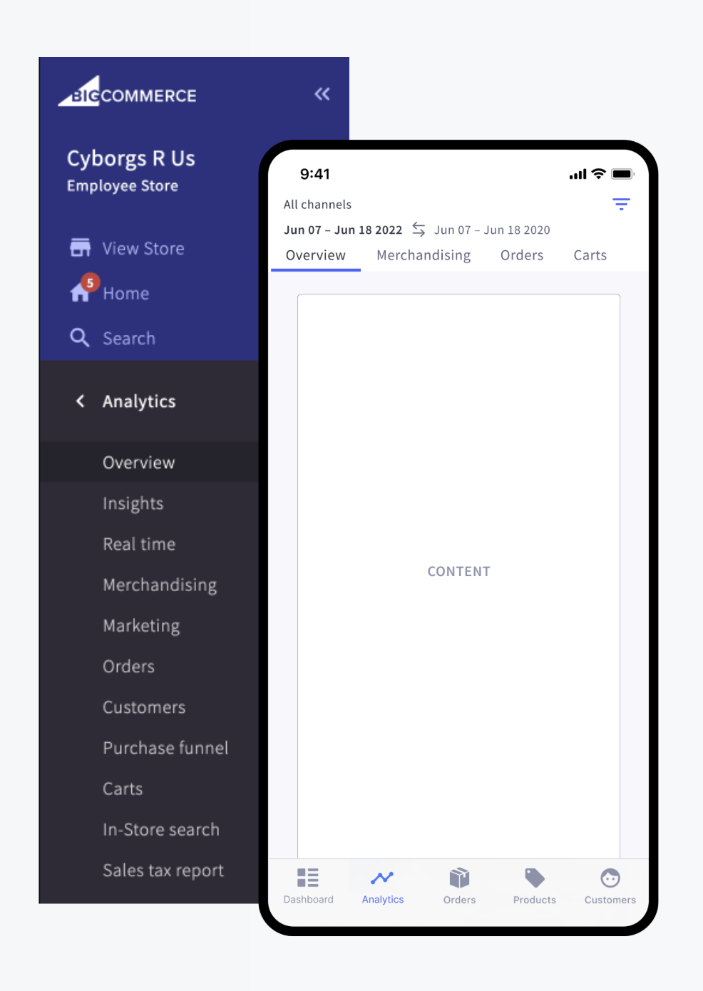
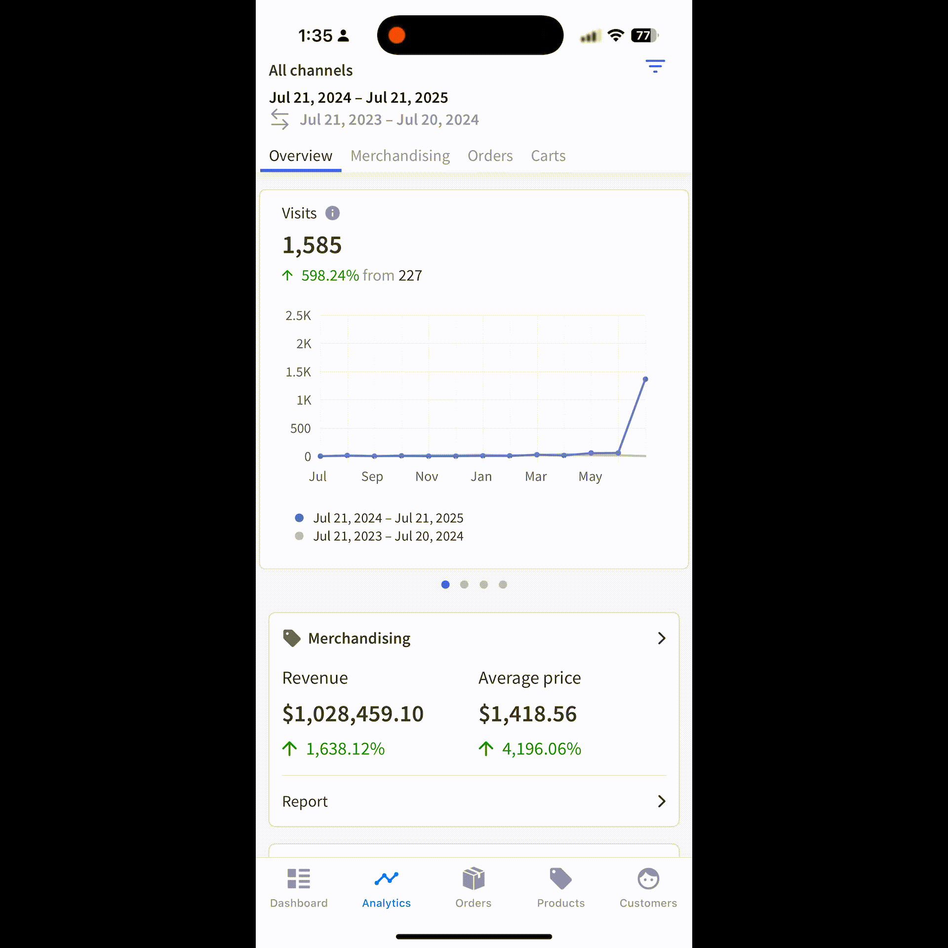
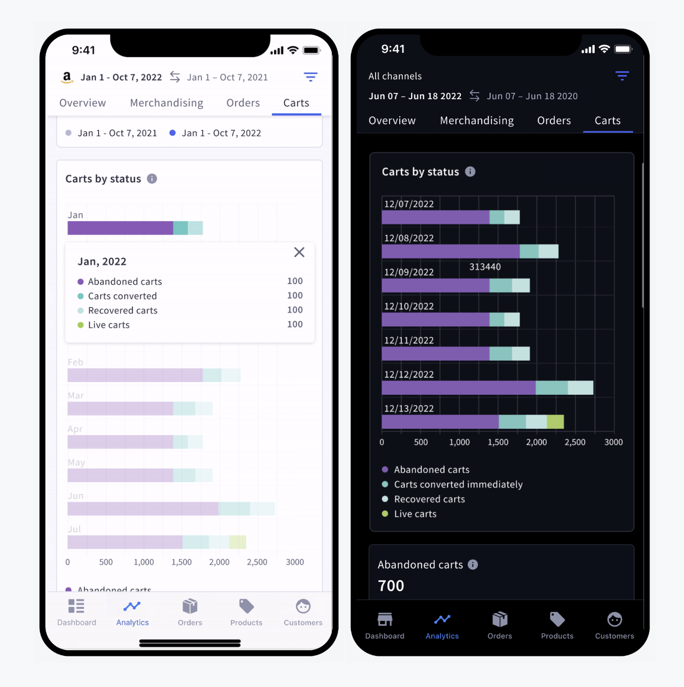
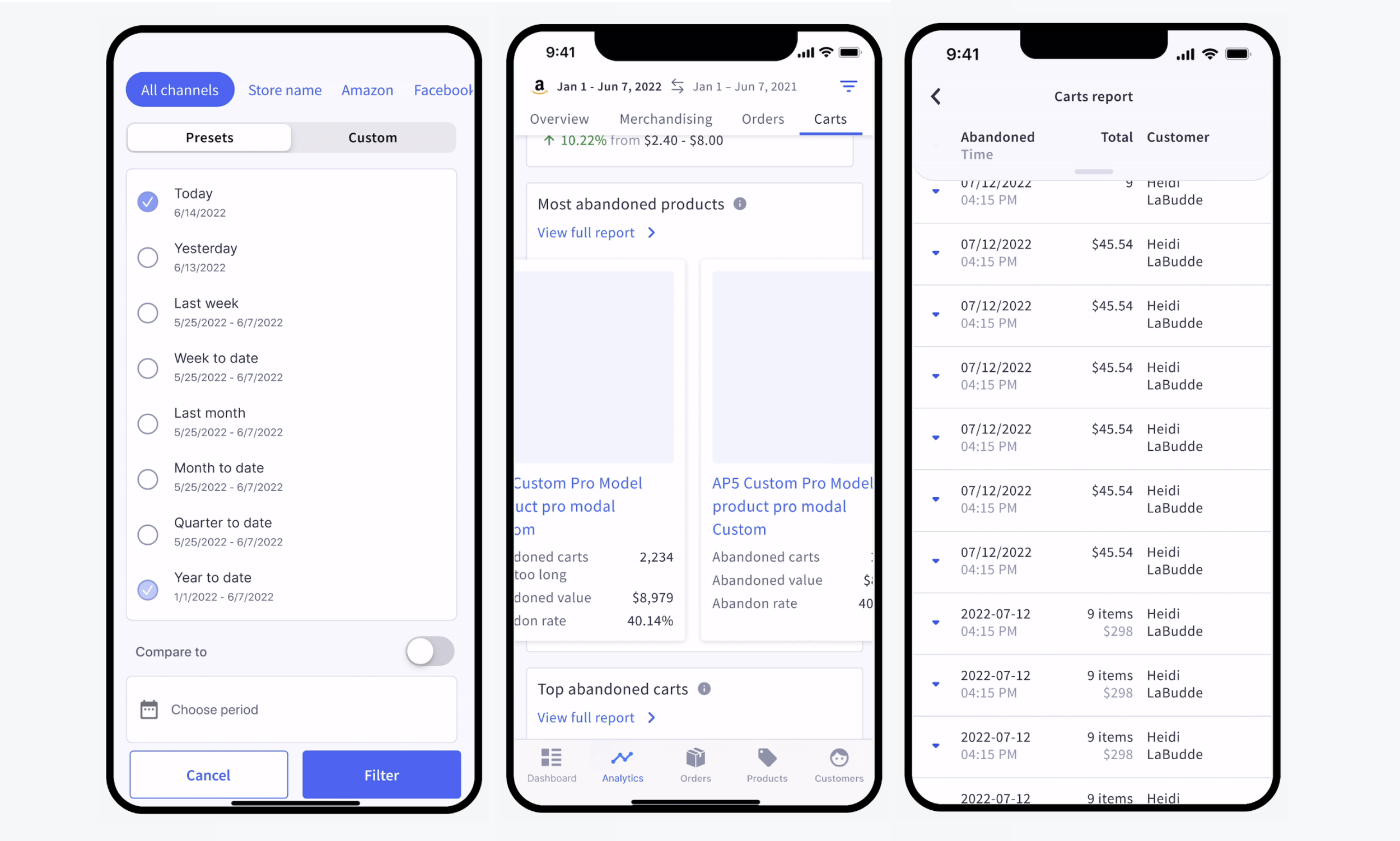
To support a more robust analytics experience, we established that analytics needed its own dedicated space outside of the mobile app’s existing home dashboard. We designed a new navigation structure that mirrored familiar sections from the Control Panel, including Overview, Merchandising, Orders, and Carts.
This approach ensured merchants could quickly find and access key reports, while maintaining consistency with the desktop experience. We also prioritized making the filter functionality visible and easily accessible, enabling users to customize their views without unnecessary friction.
Designing the Overview Page
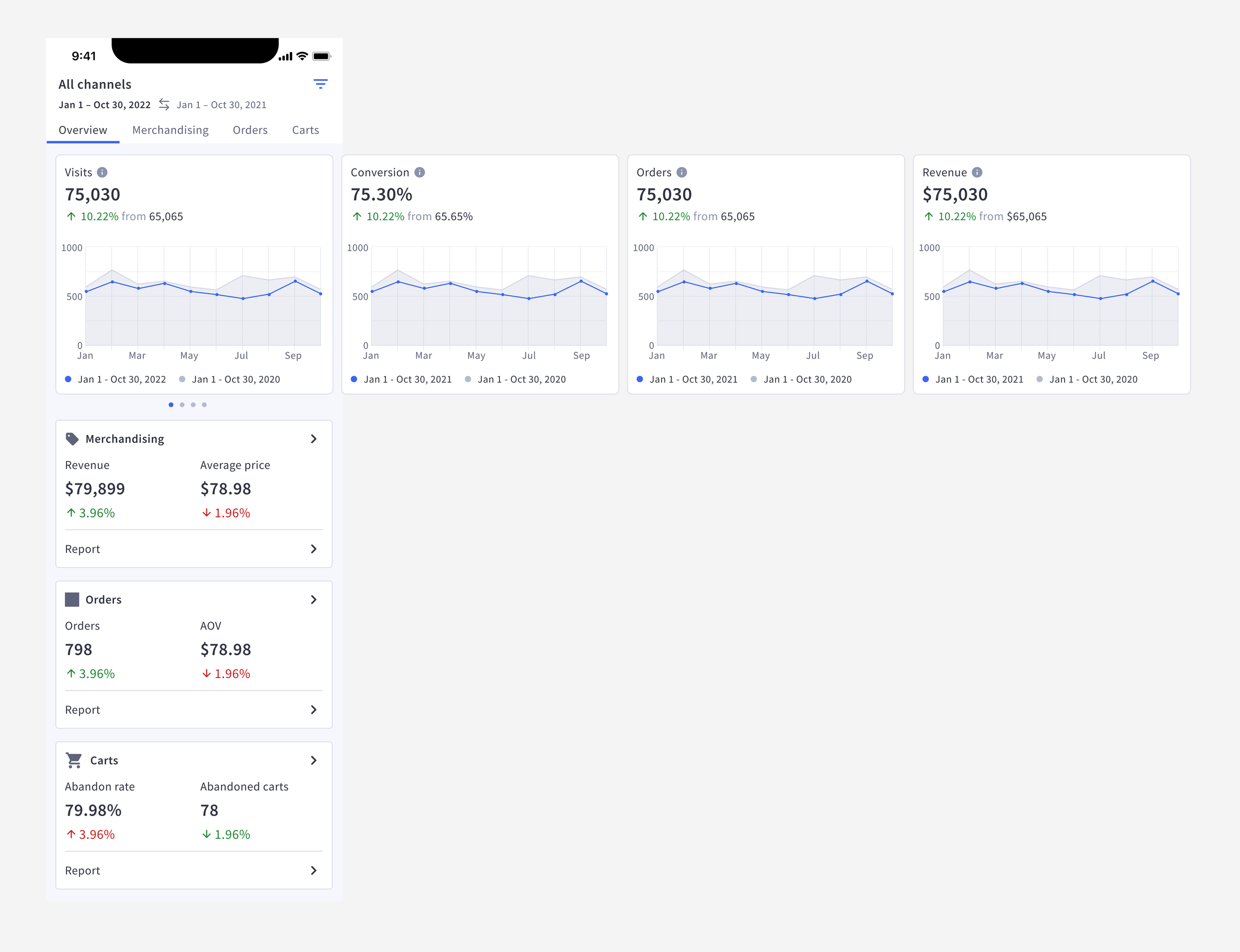
We began the mobile analytics redesign with the Overview page, which serves as both the entry point and summary layer for the analytics tab. The goal was to surface the most important metrics in a way that’s easy to scan and understand at a glance.
The top section highlights four key health check metrics—visits, conversions, orders, and revenue—presented in a swipeable card carousel with comparative charts to help merchants spot trends over time. Below that, we included snapshot previews of three key reports (Merchandising, Orders, and Carts), each designed with clear labeling and icons to improve scannability and drive deeper engagement.
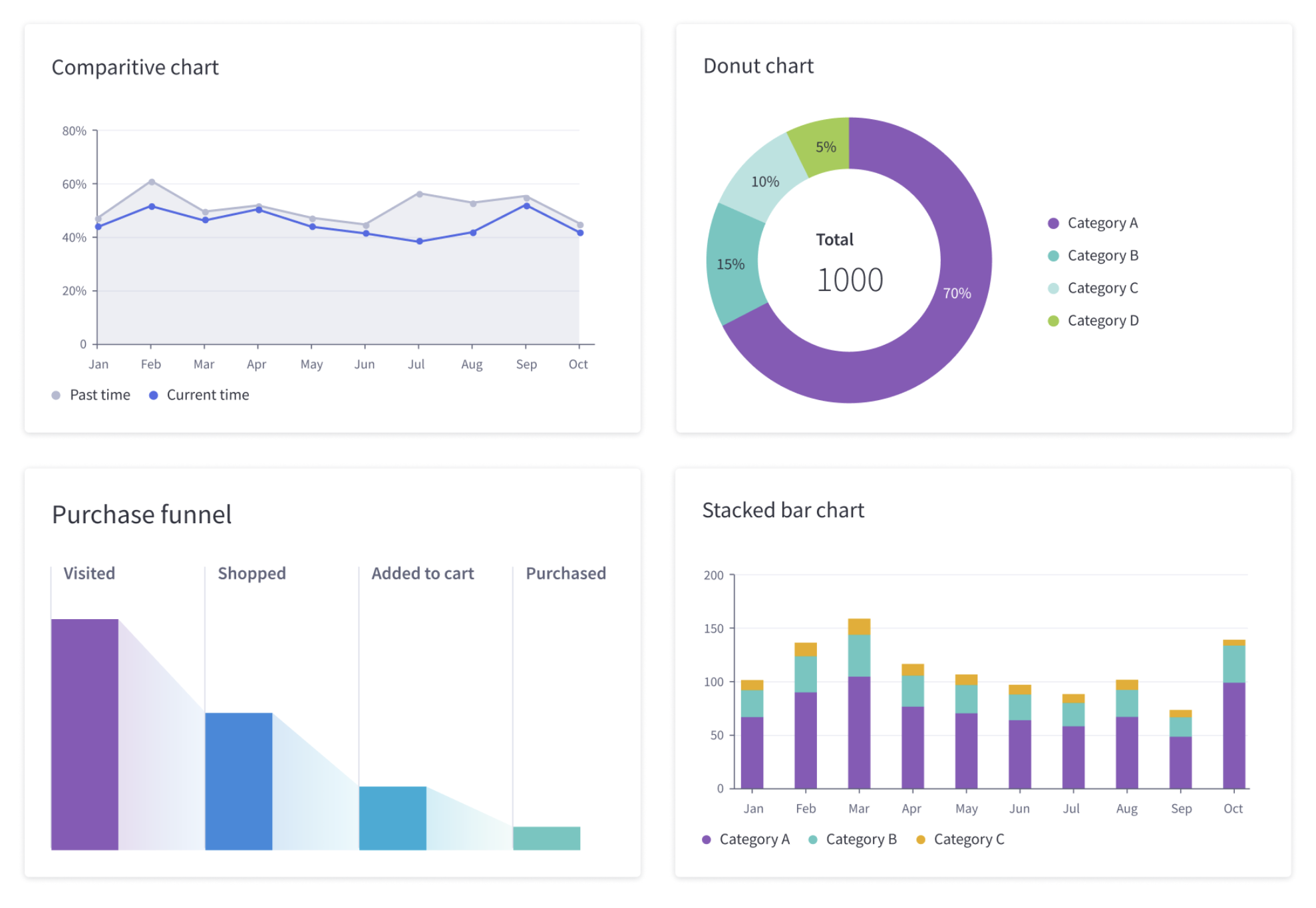
Designing Data Visuals for Mobile
To create a cohesive experience across platforms, we referenced the existing data visualization style guide—leveraging established chart types, color palettes, and design patterns from the desktop Control Panel. However, we recognized that the mobile context introduces unique usability challenges.
Merchants are already familiar with desktop analytics, so we aimed to maintain consistency while making thoughtful adjustments for smaller screens. This included simplifying axis labels, reducing visual clutter, and prioritizing readability without sacrificing insight. The goal was to balance visual clarity with data density—delivering a high-quality mobile analytics experience that felt familiar yet optimized for touch and portability.
Optimizing Data Visuals for Mobile
Following the initial chart implementation, we explored additional enhancements to ensure the visuals were optimized for mobile usability. Key improvements included:
Improved legibility across screen sizes, ensuring key data remained visible regardless of layout constraints
Vertical bar chart orientation to better fit the natural scroll behavior and mobile screen dimensions
Refined interactions, such as replacing hover states with tap actions and introducing tooltips to guide users through less discoverable features
Support for dark mode, ensuring accessibility and consistency across themes
These adjustments helped create a mobile-native analytics experience that preserved clarity, responsiveness, and functionality.
Mobile-Specific Component Design
To support a seamless and intuitive analytics experience on mobile, we reimagined several key UI components from the desktop version for smaller screens:
Filters were adapted from the Control Panel (CP) but optimized for mobile behavior, referencing patterns from familiar apps like Google Analytics and booking tools. We preserved preset and custom options while improving tapability and layout.
Tooltips maintained consistent language with CP but were redesigned for mobile accessibility—supporting onboarding and context in a more compact format. (not pictured)
Carousels were used to highlight top and bottom performers, acting as quick-entry points to deeper reports and reducing cognitive load.
Tables and reports, which featured complex data sets, were separated into their own dedicated screens. We introduced vertical scrolling, stacked columns, and collapsible headers to maximize space and clarity.
These refinements ensured that the mobile analytics experience remained both familiar and highly usable, without compromising on functionality.
Retrospective: Key Takeaways from the Mobile Analytics Initiative
This cross-functional collaboration between the mobile and data teams uncovered valuable insights that extended beyond the mobile app and informed broader product strategy.
Fresh perspective on the Control Panel (CP):
The mobile team’s involvement surfaced opportunities to rethink legacy desktop solutions, helping identify usability issues and challenge long-standing design patterns.Discovery of UX debt in CP:
Our deep dive into CP analytics revealed potential design debt—such as outdated tooltip content and limited dashboard filtering—indicating areas in need of improvement based on user behavior and expectations.The need for a stronger mobile component library:
Building a more robust, reusable component library will support future mobile/CP collaboration and may evolve into an asset for third-party app integrations.User survey insights:
Survey data revealed that most mobile users are CEOs, owners, or generalists managing multiple roles—highlighting a visibility gap among fulfillment staff. This suggested a need to improve awareness through targeted app promotion on relevant screens in the Control Panel.
Impact: Design, Merchant, and Business Outcomes
The mobile analytics initiative had ripple effects across teams and customer segments, driving improvements in quality, merchant experience, and business strategy.
Quality
The mobile team’s deep involvement uncovered UX debt in the Control Panel’s analytics experience, revealing opportunities to refine existing components and improve consistency. This work contributed to both the data visualization style guide and the mobile component library. It also sparked broader discussions about where to maintain parity with desktop UX and where to push for mobile-native improvements.
Merchants
This release addressed one of the top merchant needs: 24/7 access to performance metrics on mobile. With top-viewed analytics now available in the app, we enabled more agile, on-the-go decision-making. The project also created space to prioritize additional merchant needs moving forward.
Business
Mobile-first analytics is no longer a nice-to-have—it’s an expectation, especially for enterprise merchants. Delivering a high-quality mobile analytics experience supports new business growth, sets us apart from competitors, and strengthens our value proposition across platforms.
Next Steps: Scaling Mobile Analytics Design
Following the launch of mobile analytics, we outlined several key next steps to ensure continued quality, adoption, and impact:
Validate
Plan to user-test newly released mobile components to confirm usability and effectiveness.
Library Updates
Expand the mobile component library and enhance the data visualization style guide to include mobile-specific guidance. The library is expected to grow significantly as mobile needs are codified.
Measure
Establish analytics to track how merchants are using the new features. Measurement will guide future refinements and priorities.
Speak with Users
Conduct follow-up research with mobile merchants to assess how well the new analytics features are meeting their needs—and to identify what enhancements should come next.
case study: UX debt tracking
Addressing ux debt at bigcommerce
UX debt is the accumulation of usability issues that hinder how users understand and interact with a product. Like technical debt, it builds up over time—often as a result of inconsistent visuals, unclear copy, inefficient task flows, or misaligned hierarchy. Left unchecked, these small issues can collectively erode the overall user experience.
At BigCommerce, I led efforts to identify and resolve UX debt across key surfaces of the platform. This included influencing the resolution of over 287 tickets that addressed:
Confusing or inconsistent UI patterns
Inefficient task flows and unclear interaction models
Visual hierarchy, copy, and design inconsistencies
Our approach focused on aligning with UX quality principles that reinforce product value: ensuring the experience is useful, efficient, usable, and desirable. These attributes directly support product quality by making the platform easier to navigate, faster to use, and more delightful for our merchants.
By treating UX debt with the same strategic importance as technical debt, we improved user satisfaction, reduced support friction, and built a stronger foundation for future product iterations.
A slide from a presentation I created at BigCommerce to advocate for UX debt cleanup and encourage cross-functional teams to prioritize usability and experience quality.
auditing
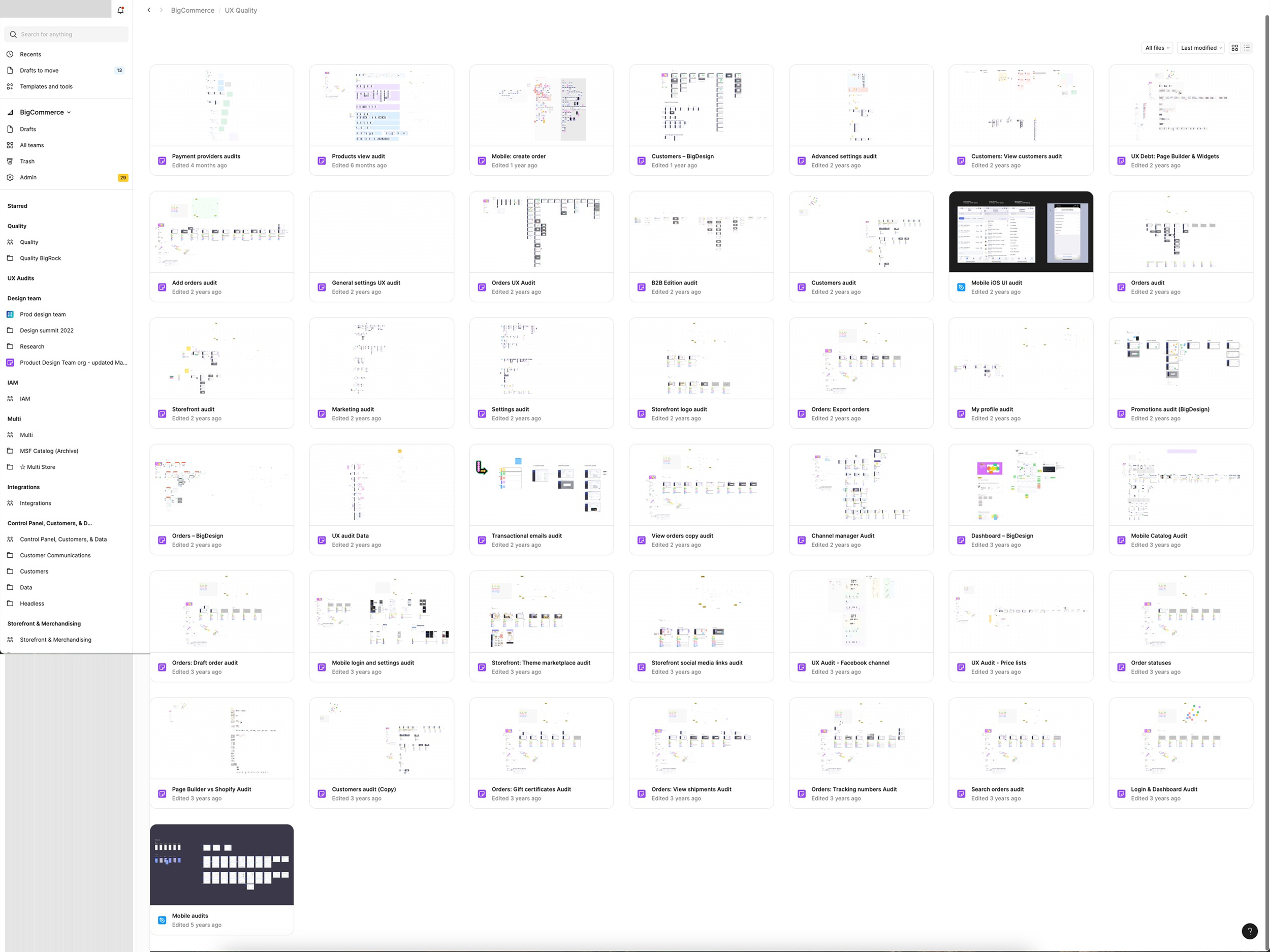
Over the course of our UX debt initiative, our product design team collaborated on more than 43 in-depth audits of the internal Control Panel and its companion mobile app. These audits became a cornerstone of our effort to uncover usability gaps, streamline core workflows, and elevate the overall quality of the experience for both merchants and internal users.
We launched a series of UX audits to assess key workflows and heavily used areas of our internal Control Panel. To ensure consistency across teams, I developed a standardized audit template that integrated with our Jira workflow, making it easy to document, organize, and prioritize findings. As part of the process, we established a shared labeling system to classify each issue by UX quality themes, allowing us to better assess impact and track patterns across surfaces. Each issue was labeled with one or more of the following themes:
Interaction: Do actions model expected and consistent behavior?
Task flow: Does the functionality match the task flow the user is trying to complete?
Copy: Do we follow our UX writing guidelines?
BigDesign/Styling: Is it utilizing BigDesign components?
Navigation: Does the navigation make sense?
Documenting
We logged each issue in Jira using defined labels and categorized them under the appropriate team or project. To improve visibility and prioritization, we grouped related issues into dedicated UX debt epics that aligned with each team’s workload and backlog.
Since UX debt ticket types didn’t exist at the time, I partnered with the Jira admin to create a custom ticket type with its own name and icon and description content. I then introduced this framework to the Product & Engineering organization during one of our quarterly design presentations (sessions designed to share ongoing design initiatives and decisions with all cross-functional team).
We also guided teams on how to assess and label each UX debt ticket as low, medium, or high impact. These impact levels helped teams prioritize which issues to tackle first, while also allowing us to track resolution progress across categories and measure the overall effectiveness of the cleanup effort.
Each ticket should include a UX impact label—uxlow, uxmed, or uxhigh—to help teams prioritize their work and support tracking, measurement, and overall impact analysis.

We clearly defined the criteria for low, medium, and high impact to ensure consistent evaluation across teams.
Tracking
To measure the impact of our UX debt cleanup efforts and connect them to broader product health signals like customer feedback and bug reports, I designed a UX debt dashboard in Jira. This dashboard gave us real-time visibility into the volume, type, and resolution rate of UX debt issues across all teams. Over the course of the 3-year initiative, it became a key tool for tracking progress—highlighting where debt was being logged, which teams were making headway, and where additional support or prioritization was needed.
The dashboard also played a critical role in goal-setting. We used it to define quarterly and annual targets, such as completing backlog refinement by end of Q3 2025 and increasing UX debt activity (both logging and resolution) through Q2–Q4 2025. This helped establish accountability across the org and provided concrete metrics to support our design quality initiatives.
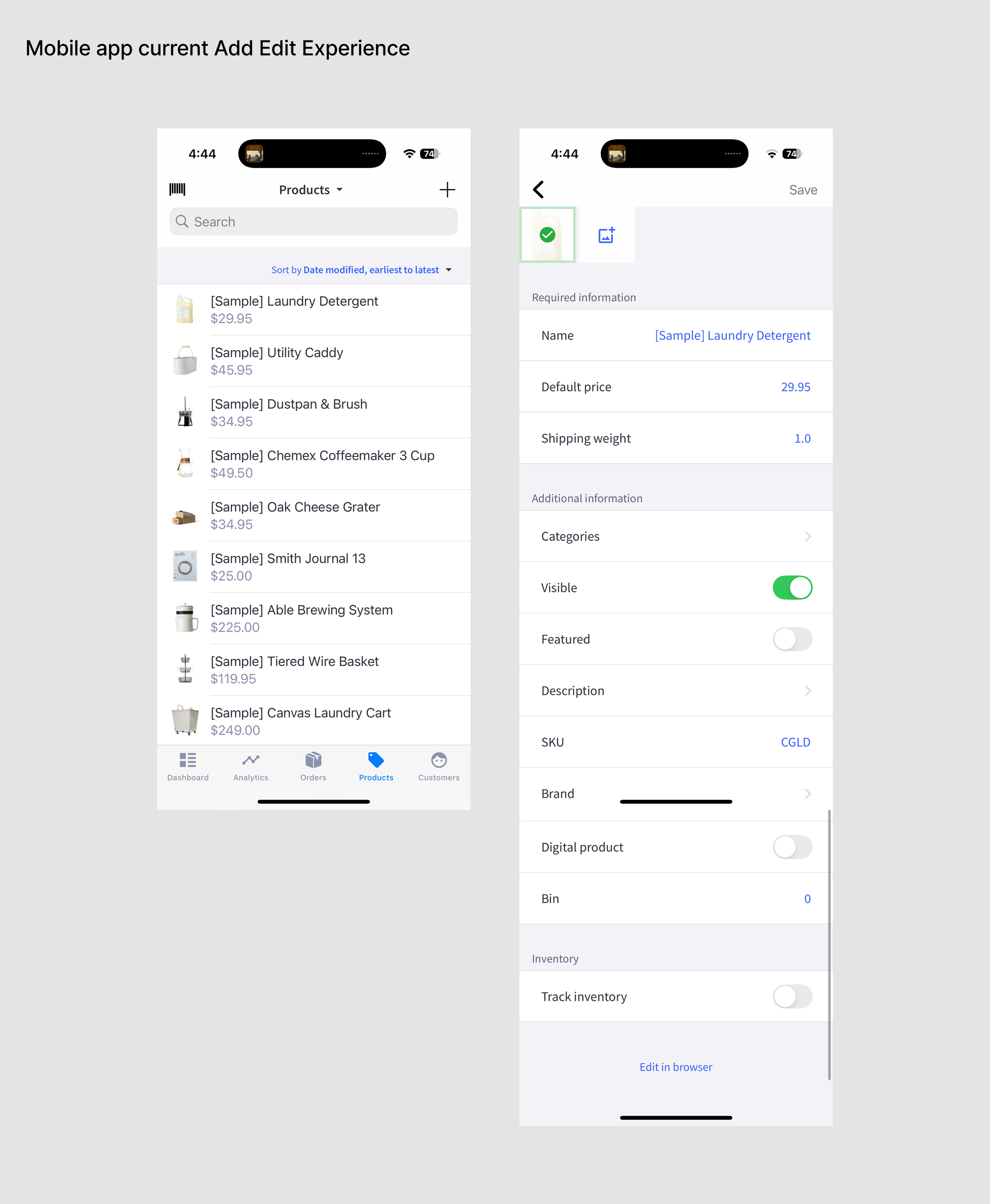
Quick Look: Redesigning Mobile Product Management
From limited FUnctionality to full management capabilities
The first iteration of Mobile’s product management—known as Add Edit—was designed as a lightweight tool, allowing merchants to quickly preview and make basic product updates. While it served that initial purpose, it fell short for users with more complex management needs. Insights from app reviews, surveys, interviews, and support feedback made it clear that a more robust solution was necessary. The challenge was determining the right approach: should we deliver a complete overhaul with full functionality in a single launch, or release the most valuable features iteratively to quickly deliver impact while continuing to refine the experience?
Understanding the problem
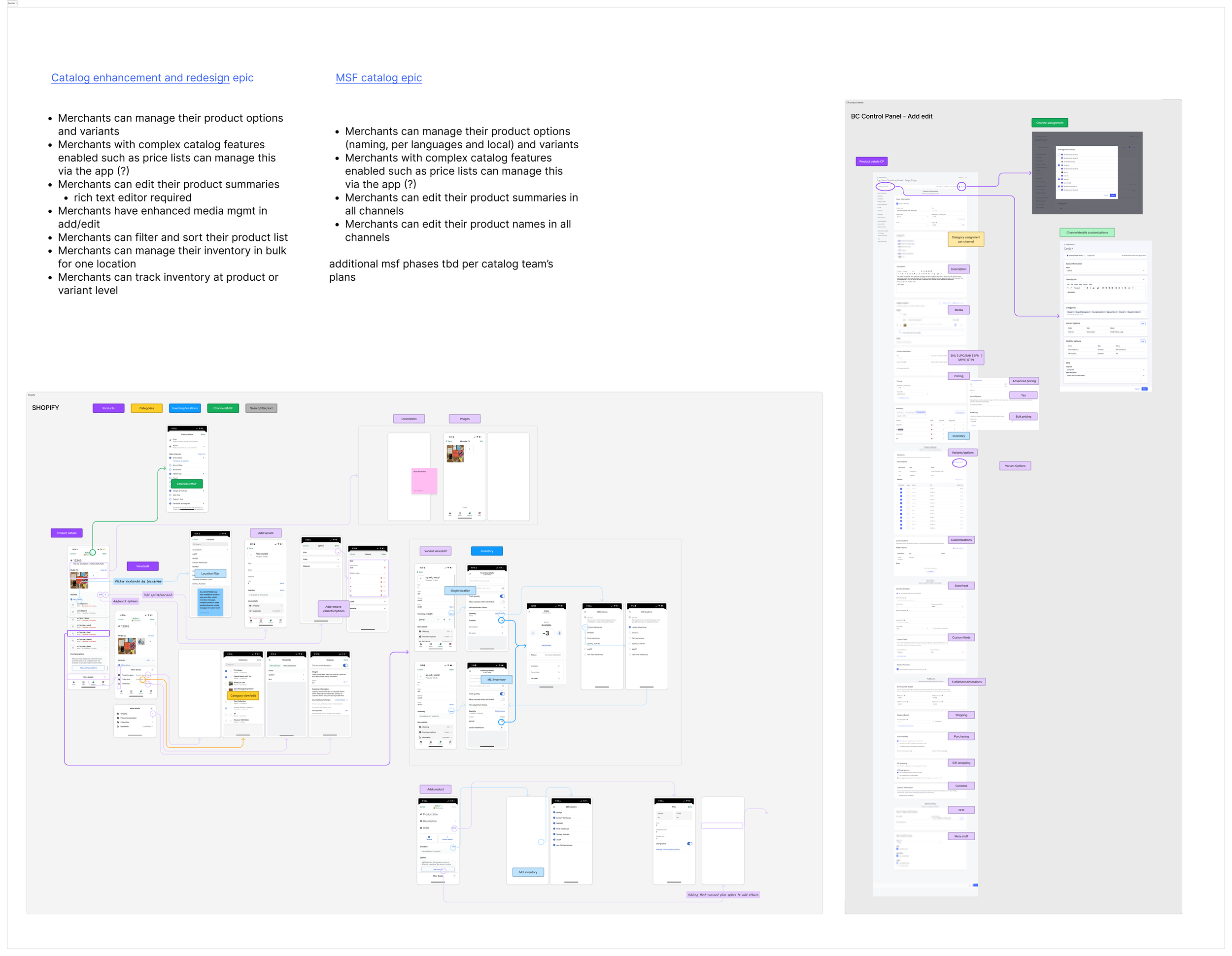
Before deciding on the right redesign and launch approach, we needed a complete picture of the challenges ahead. It was clear that mobile’s product management experience had to evolve beyond basic viewing and editing to include robust functionality—most notably, support for multi-storefront (MSF).
We reviewed the existing BigCommerce desktop experience alongside Shopify’s mobile approach, tackling each in separate epics but treating them as part of the same overarching problem space. My role was to design an entirely new experience that incorporated all new capabilities, including MSF, and then determine how to break that solution into iterative, manageable releases that could deliver value quickly while continuing to build toward the full vision.
More Catalog content coming…….
Want more?