Silvercar By AudI
This collection is a sample of the UX UI work I have contributed to the consumer and internal apps at Silvercar. My involvement has included design for responsive web, iOS, and Android, including maintaining consistency across platforms and between consumer and internal apps.

Competitive analysis + pricing visibility Case study
I led a competitive analysis exercise with my product managers and product director. We assessed the booking websites of Enterprise, Budget, Southwest Airlines, Kayak, and Starwood Hotels, alongside where Silvercar compares and contrasts with them.
From there I used that analysis to launch specific research around how our pricing UI aligns with the car rental market – specifically on the vehicle selection and price breakdown screens. I found that we were lacking a critical usability item. Our vehicle selection screen only displayed the daily price for our options. We did not display a total price estimate for each vehicle option. Which meant that the user could not see their total price options until they selected a vehicle and went back and forth between options.
In addition to this usability issue, our stakeholders were pushing an initiative to offer and display a weekly rate into our product and the third party booking apps. Some of the car rental companies offered and displayed this rate, some offered the discount rate but did not display it. I initiated several rounds of testing to find out if the users were more interested in the seeing the daily rate with that weekly discount, or wanted to see the phrase “weekly rate” when viewing car options. Would they like to see that “weekly rate” verbiage once they were past their options and viewing the final price breakdown?
The results spoke to a strong preference to display daily price and total price on vehicle selection screen, and display rate type (such as weekly rate) in the final price breakdown. This change in UI was first built and published on our web and Android booking apps. Later we applied it to iOS and our Google Analytics reflected a lull in iOS conversions during that time until the iOS UI was updated to display daily price alongside total price on vehicle selection screen.
Vehicle UI improvements
Following the pricing UI improvement, we knew that with more car options, we would need an updated UI to work responsibly and align better with what our users were expecting to see.
We explored and tested vertical stacked layouts and cubed grid layouts. Competitive rental companies displayed both layouts and appeared to also be testing those layouts. With our limited car option offering, we decided a grid layout was not necessary and a vertically stacked layout would utilize the UI’s potential to showcase our quality car options.
I wanted to make sure the vertical layout that most car rental companies utilize was serving our user best. What if the web classic F-layout would be a better option? Stack the copy and buttons on the left and imagery on the right. But I also needed to consider the car rental standard of imagery on the left and models, pricing, and buttons on the right. The photo on the right displays a result and example of one of those tests variations. More mistakes were made in the first example. The user took more time to make a decision. The second example had less mis-clicks, and they needed less time to make a decision. My assumption was incorrect, but the data pushed me in the right direction.
*Note* Enterprise, one of our competitive analysis brands, has seemingly pulled their A-B UI testing of stacked vertical vs cubed grid layout. They have landed on the stacked vertical for the time being. However, they continue to display pricing in weekly rate and total price instead of daily rate, when viewing the car selection screen. I have made a habit of watching their trends since they lead the market in utilization, conversion, and A-B testing.
Below you can see where we landed and are currently improving upon.
SuperConcierge (or) Toolkit 3.0
Internal iOS App
I completed a total redesign of the iOS mobile app, SC Toolkit. The concierges use it for a number of tasks, including but not limited to the monitoring of incoming pick ups and returns, checking customers in and out of rental cars, and managing their fleet.
Log in screen included improvements by adding account recall and auto-select location by geo-location. The choose account UI is useful for when multiple concierges are sharing devices. The auto-select location is useful for many levels of users, since regional managers may not want a default location.
The improved daily manifest is the huge winner for this redesign. The UI is much more intuitive with improved visual scan-ability, efficient operation, and clear iconography.
Reservation details not only makes checking drivers in and out more efficient, but also allows for more function around notes and contact info. The same visual iconography is carried over into these screens as well.
The UX of starting a rental with the manifest and reservation details did not employ a ton of changes from the old build to the new build. We didn’t want a long list of SOP changes or UX changes to create unnecessary training. However, simple improvements, short cuts, and error preventions were utilized to improve the existing UX around rental starting.
Fleet management gained huge strides as well. Where the user was once limited to scanning nearby vehicles or locating via Bluetooth signal, we could now upload an entire fleet library for maximum transparency and use. Filters were added to show and hide cars in specific states and BT range.
We did rounds and rounds of surveys to our operations crew to pull feedback as we released piece by piece. But nothing reminds you why you do the job you do like a thank you note. <3

Silverware
An internal management tool
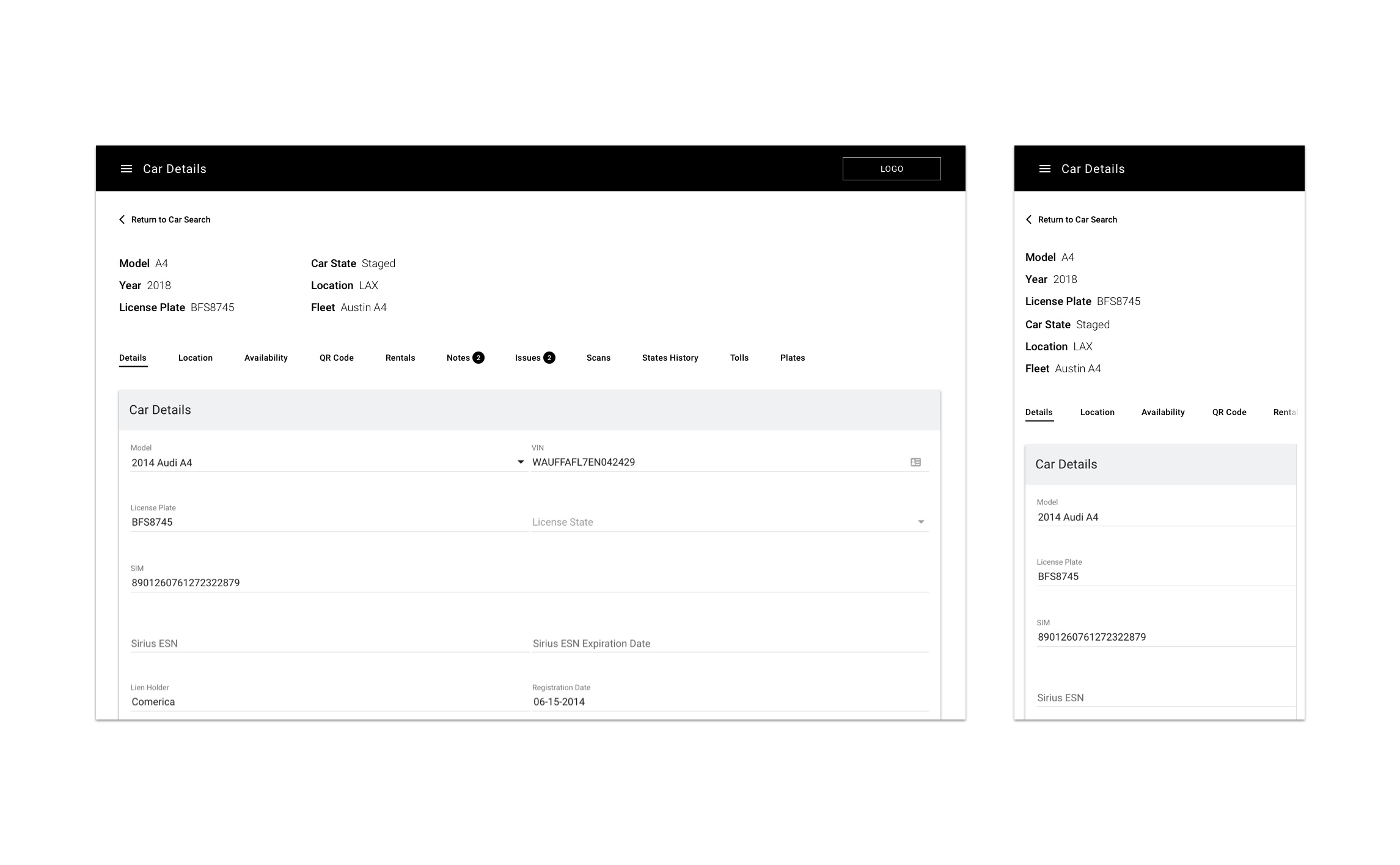
Silvercar needed some major overhaul in the back-end and front-end to fix an incredibly debilitating tech debt issue. When our product was first launched, it was created with a dependable of offering one premium car option so renters always get exactly what they expected. As the product and company grew, that product offering became limiting and stale. It also created a huge problem for our technology. After months of faking our multi-fleet offerings, we needed to create the technology to support many fleet offerings per location. The epic “Mulit-Fleet” was launched.
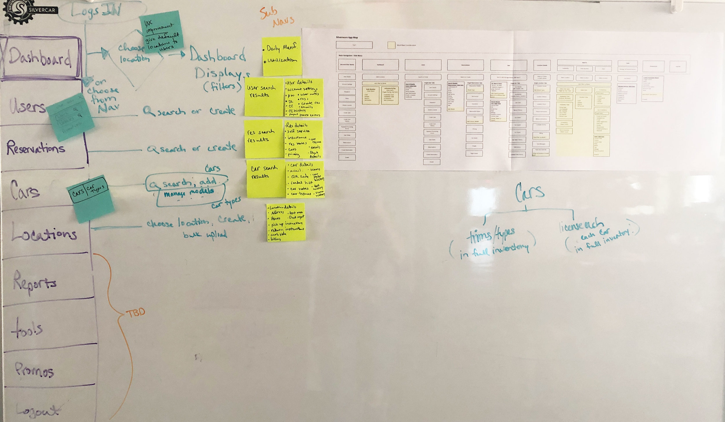
I collaborated with the product manager to draw out a storyboard to name every user story along this path. We collaborated with stakeholders in workshops to nail down what we had missed. Then upon multiple interviews with developers, experts, and stakeholders, we drafted the MVP and follow-up iterations. I drafted the user stories alongside the PM and our development/agile team defined the sub tasks needed to support each MVP user story.

Multi-fleet MVP Storyboard: Expand for Detail.
The New Silverware Space: an iterative approach
In order to improve our technology, our desktop app Silverware has been in need of some crucial improvements. We are iteratively adding new or improved functionality while moving to a new environment in React. I have been exploring how to guide the user from the home/old environment into the new one without feeling like a chaotic journey. The functions we are adding and rebuilding are scattered across several areas of the app, so this UX exploration has been about creating a consistent and familiar path every time.
Fleet management that makes sense
By taking an iterative approach, we skipped over developing the sub-navigation items for MVP. This would give UX the opportunity to explore the new app’s IA and reorganize some navigation and hierarchy issues in the old app. The interim experience is a little disconnected, but allows us to move forward intelligently as we learn things along the way.
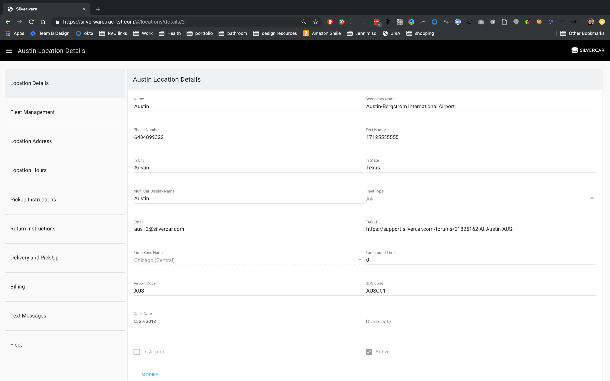
Since our old technology didn’t support multiple fleets per location, we began re-writing what Location Fleet Management really meant. Our old fleet management only allowed to change the size of that one fleet. The new system allows for our users to add fleets (car types), view the types of fleets at the location, the number of vehicles in each fleet, and what the availability window is.
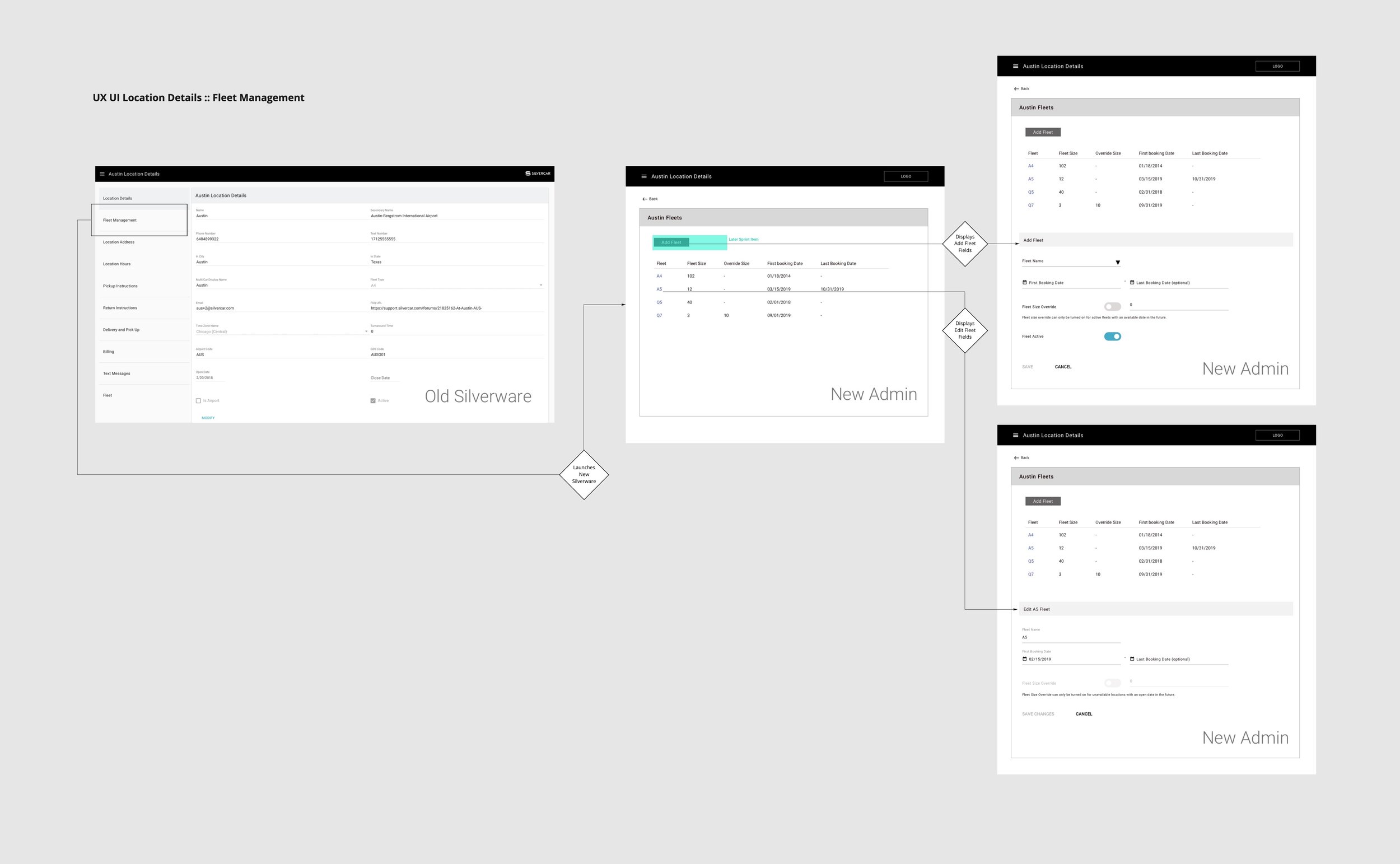
Now that we have multiple fleets offered at each location, our users need to be able to manage fleet specific pricing. Most of that leg work is handled in third-party-tools that have already built robust tools for pricing. However we still needed to improve our tool to display the top level information for fleet specific pricing, offer filtering and pagination to make it useable, and a way to download that data. Adding the fleet/car type filter, the daily or weekly filter, date filter, and sorting functions are all new UX elements. Additionally the pagination is much easier to use, rather than just the previous, next as was built in the old Silverware.

EXPLORING SILVERWARE’S IA AND NAVIGATION ISSUES
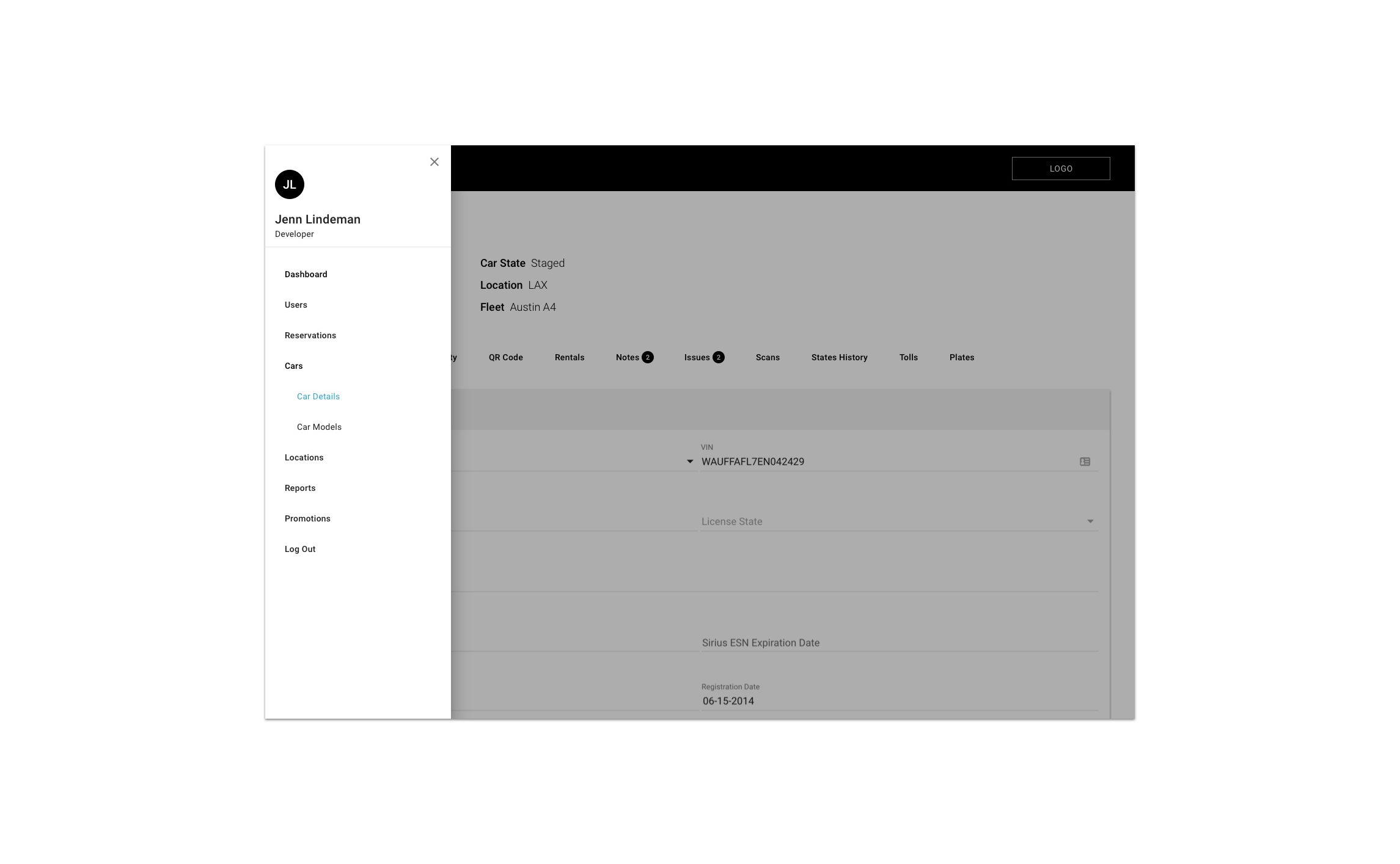
Our company’s internal tool is difficult to learn because of some complicated and confusing IA and UX. I believe that as we rebuild Silverware in our new environment, simplifying the structure will create a much better experience for new and old employees as they navigate through their tasks.
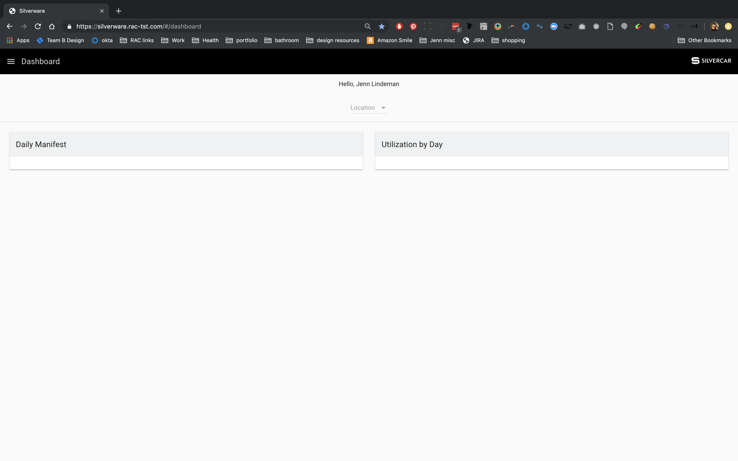
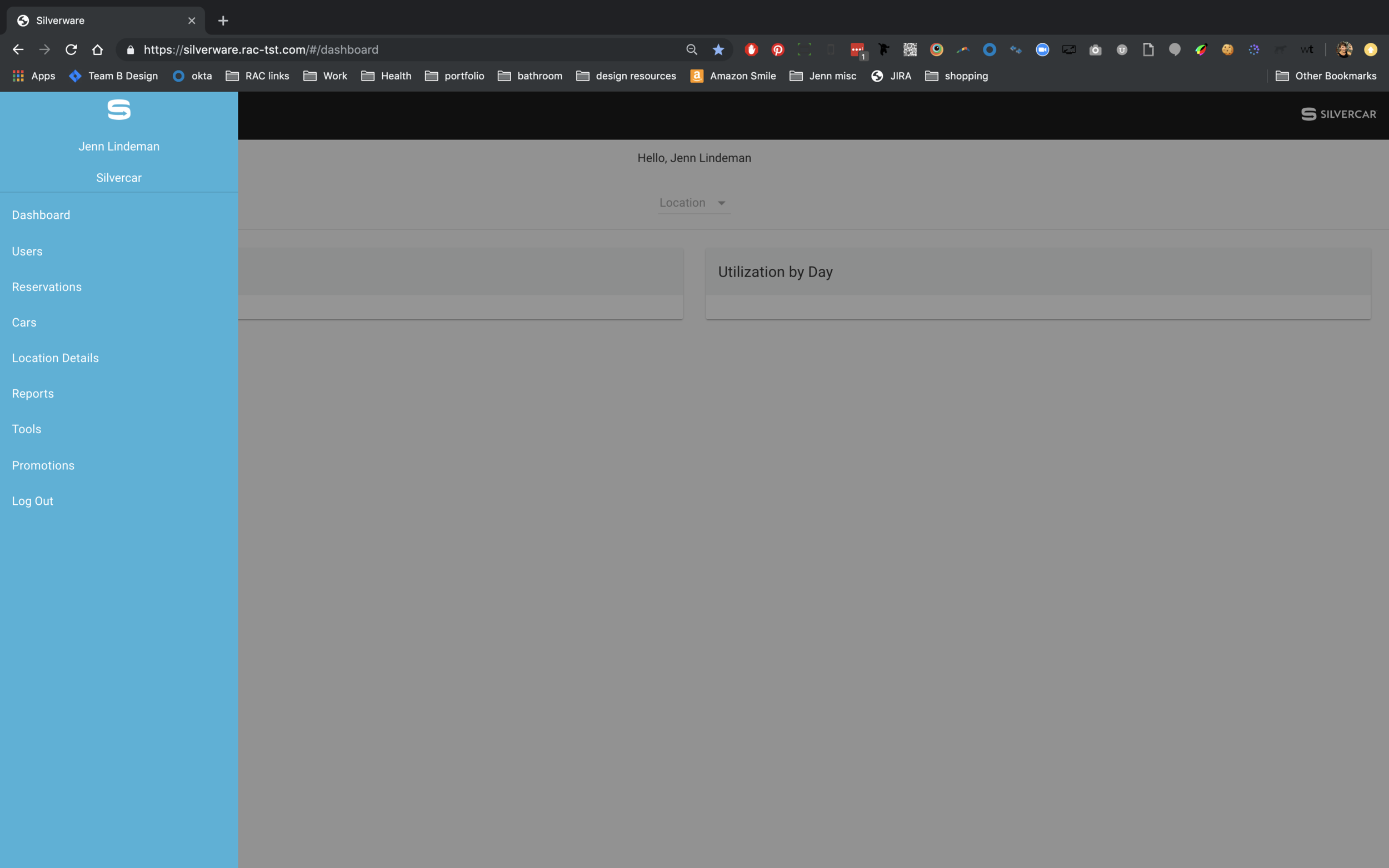
Upon landing in Silverware, the user is greeted with a nearly blank page and a drop down to get started. We could build user default settings to land them in a specific location’s dashboard.
This experience of landing on a nearly blank page with a solo drop down or search bar happens throughout many top level pages. One method we’ve discussed is implementing a search field in our navigation per those top level navigation items.
Another issue is that our sub-navigation styling is awkward and doesn’t feel like navigation. The tabs sometimes hold top-level information that needs to be displayed so traditional tabbed navigation will not work.


Below I’m currently exploring how some simple tabbed navigation can work if we create header items for the crucial data that is needed from the details and other spaces. Other tabs can utilize simple alert icons.
I will update this IA and navigation exploration as we continue to solve this problem.
Want more?